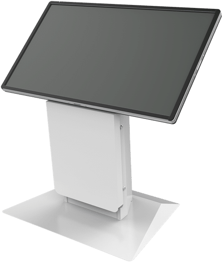
Successful kiosk design is both an art and a science, with the best-designed kiosks leveraging appealing esthetic design practices together with the latest technologies. Well-designed kiosks are simple, durable, engaging and empowering. Overall, successful kiosk design creates a compelling package that rewards users and host organizations alike.
Simplicity & ease of navigation
In terms of successful kiosk design, simplicity is the key. Simplicity attracts while complexity repels, and the best kiosk designs are simple, attractive and engaging. Customers seek intuitive, hassle-free solutions from kiosks, and successful kiosks use uncluttered screens that invite users to interact with them.
Whether a kiosk is designed for retail sales, healthcare screening, or way-finding within a location, it must quickly meet users’ needs for relevant content and valuable functionality. A winning kiosk design features simple displays that serve to minimize confusion about choices. Each screen should show users exactly where they are in the interaction process, and intuitively communicate the next steps to be taken by the user, and only the minimum number of on-screen elements needed for the transaction, such as buttons, icons and images should be displayed. When used appropriately, the choice of on-screen elements will quickly guide users through each milestone in their transactions.

Expert kiosk design relies on consistent graphics, font styles, and screen layouts with only a few, contrasting colors between foreground and background elements. Successful kiosks use large buttons instead of small ones. It’s also best to avoid “Yes/No” buttons. Instead, specific text describing the functions helps users avoid indecision and quickly move forward in the transaction process. In addition, the relative size, color and shape of buttons can be used to show the relationship between functions.
Today’s multi-touch kiosks allow multiple points of contact with the screen, so functions can be enhanced as well as streamlined. Still, in order to be successful, the overall display must remain simple and intuitive.
Engage more of the user’s senses
Beyond the visual and tactile senses, the best kiosk designs engage users’ other senses, too. Well-designed sound feedback, like button clicks and confirmation beeps, keeps users engaged, and lets them know they’re on the right track toward completing their objective. Video can be powerful, yet good kiosk designers use it sparingly, and always in the context of benefiting kiosk users.
It’s best to keep the volume low and make sure that sound and video effects are used to signal users rather than entertain them, unless the kiosk is dedicated to gaming or entertainment only. Even when audio is used alone, the overuse of sounds – especially music – can be distracting or even annoying when it draws unwanted attention to the user.
Above all, the best kiosk designs ensure sure that all content signals a clear call-to-action in order to keep users timely moving toward fulfilling their objective, especially when other users may be waiting to use the kiosk.
The more specific the kiosk’s focus, the better its results
Kiosks work best for specific, clearly-defined tasks. Overcrowded screens or unrelated functions can cause user confusion and disappointment. If a web site is ported to a kiosk, it’s best to limit the range of functions as well as the available content – kiosks may fall short when displaying web pages, and hover-overs and hyperlinks may not work effectively.
The bottom line with a successful kiosk design is always its ability to lead the user on a linear path from beginning to end, with a clear call-to-action. Users must see at a glance what they’re committing to when they use the kiosk, and they must also see an obvious benefit in using the kiosk to undertake their transactions.
In summary, designing successful kiosk systems is both an art and a science. If you’d like to learn more about how Olea develops the most attractive and user-friendly kiosk designs, please contact Olea Kiosks today.

