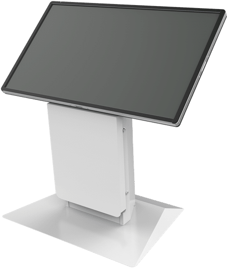
Kiosks are a significant investment for any business, so it’s important to plan and deploy them correctly for optimal results. When chosen properly and placed to maximize their use, kiosks offer a strong competitive advantage and exceptional return on investment.
Love at first sight
The first step toward success is to consider how kiosks’ features may attract or repel users. A good first impression is the key, and the most effective kiosks are attractive and easily noticed. When a kiosk has a modern design with an inviting default screen, it will attract a wide range of users who will feel excited to try the new automated system.
The design and layout of touchscreen content should be straightforward and inviting, without being annoying. The best kiosks feature a simple screen with only a few choices, and simple icons or images that easily lead users to obvious functions will make the kiosks appear intuitive and easy-to-learn.
In contrast, poorly-designed screens may make a kiosk appear intimidating to new or one-time users. Too many choices suggest that users must first spend time learning to use the equipment before proceeding onward, resulting in these kiosks being underused or unused altogether.
Look & Feel: Is it a tool or a toy?
Many kiosks look like computers, which most people associate with either “work” or “play,” and the best-designed kiosks resemble a sort of middle ground. They are attractive and engaging digital tools for accomplishing a specific task, yet they do not suggest time-consuming drudgery. At the same time, the fit and finish of the kiosk should reflect the quality of the organization – cheap looking equipment and design will be a turn-off to your audience.
The best saturation and strategic placement
Organizations sometimes buy too few kiosks, and this scarcity of equipment can create several problems for customers, including crowding and long wait lines. These situations may leave customers feeling pressured and cause them to walk away.
For an optimal user experience and best return on investment, kiosks should be placed in prime locations, easily visible from the intuitive path of users who may be visiting a particular building or site for the first time. The appropriate locations can be identified by carefully reviewing the layout or floor plan of each site. Also, when planning kiosk placement, it is important to place the equipment in or near high-traffic areas, while avoiding choke-points.
Most kiosks are free-standing models that have a footprint; however, in order to maximize the use of tight spaces, such as in retail stores, many kiosk models can be adapted for mounting on a wall, shelf, or end-cap.
Kiosk-based advertising
Successful kiosk-based advertising requires a much different approach than internet-based advertising. It is important that the initial screen avoids making a loud, blatant presentation, as many users may view this as a sign that subsequent screens will rely on hard-sell tactics.
A kiosk’s internet connection and browser interface, if any, should be carefully managed to reduce customers’ wait times and allow for a pleasing experience. Studies have shown that users will lose patience if the desired content fails to load in as little as 3 seconds, so it is best to store content on local servers. Also, using content that has been designed and optimized for touchscreens helps to ensure the best user experience and highest customer satisfaction.
For kiosks in retail environments where multiple product choices are displayed, it is best to use an interface that allows quick scrolling, which can be achieved with well-designed thumb wheels. Typed-in query interfaces should utilize quick, intuitive auto-complete functions to assist users in finding what they need.
In summary
Along with increase revenues through precisely-targeted advertising, kiosks also offer an improved customer experience and significant savings in labor and other expenses.


